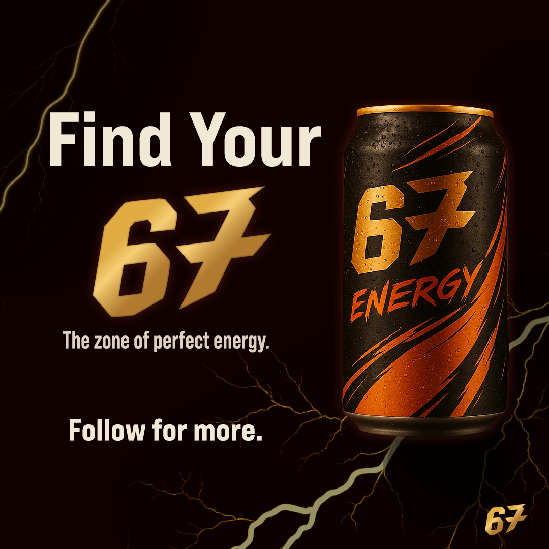
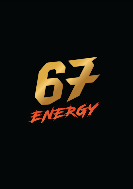
67 Energy Logo Design
A signature logotype built for impact and recognition.
A 10 second motion graphics Instagram reel created to promote Sunday Shades’ “Two Better Than One” sale. The ad combines bold animated typography, smooth zoom transitions, and a vibrant gradient colour palette to highlight the offer clearly and quickly. Designed for vertical mobile viewing, the reel focuses on visual clarity and pacing to deliver an eye-catching promotional message suited for social media engagement.
Created as part of the CNB DrugFree.SG competition collaboration, this narrative film explores how cultural pressure, social influence, and environment shape a young man’s path into experimenting with drugs. Blending present-day moments with fragmented flashbacks, the story reveals how curiosity and peer expectations can escalate into danger, highlighting the emotional and social consequences that follow.
A short ENG-style documentary investigating the light-hearted “bird nuisance” at the Republic Polytechnic canteen. The film combines interviews, on-location reporting, and observational humour to show how students navigate the daily disruptions caused by hungry birds. Produced with a single-camera workflow, it balances journalistic structure with playful storytelling to keep the tone engaging.
A one-minute anti-scam short film created for the #YouthAgainstScam competition. The story follows a struggling student who accepts an easy “job” offering quick cash, only to realise he is being recruited as a money mule. Using dramatic pacing, clear visual storytelling, and a freeze-frame educational message, the film raises awareness of how youths are targeted by job scams and the serious consequences involved.
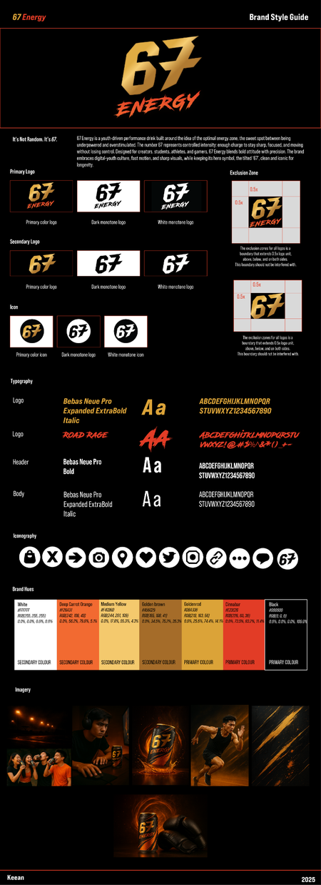
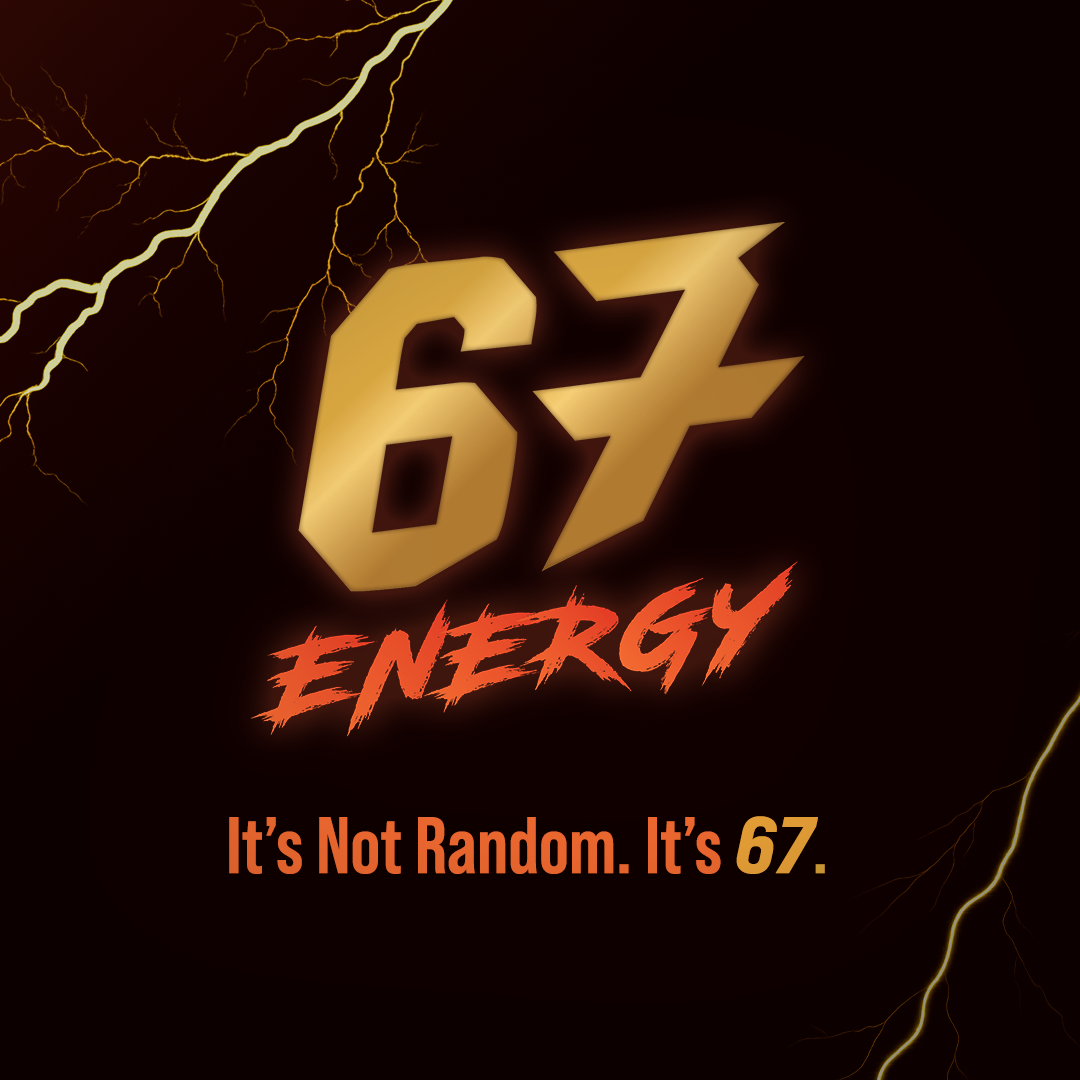
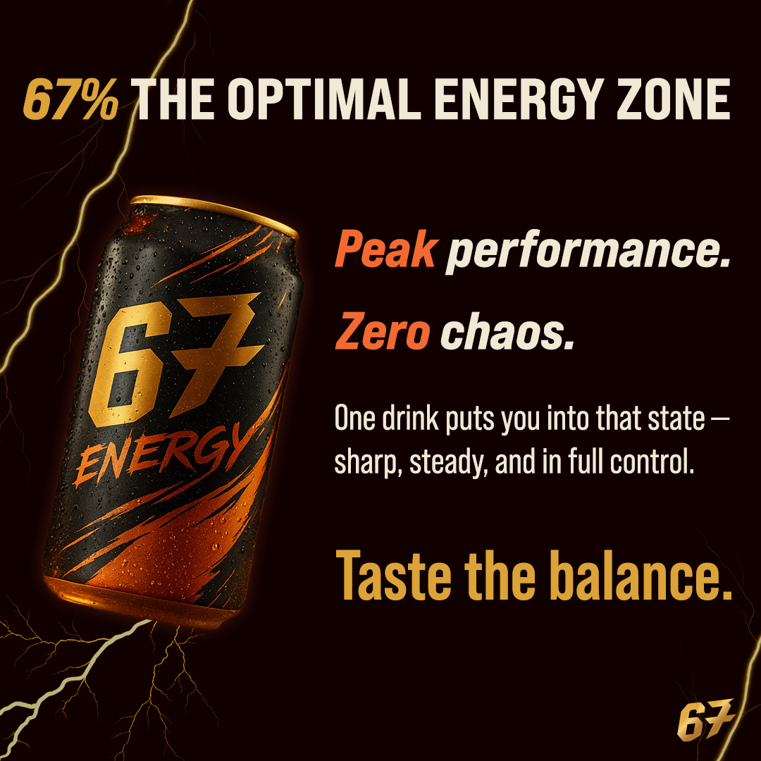
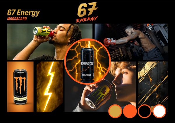
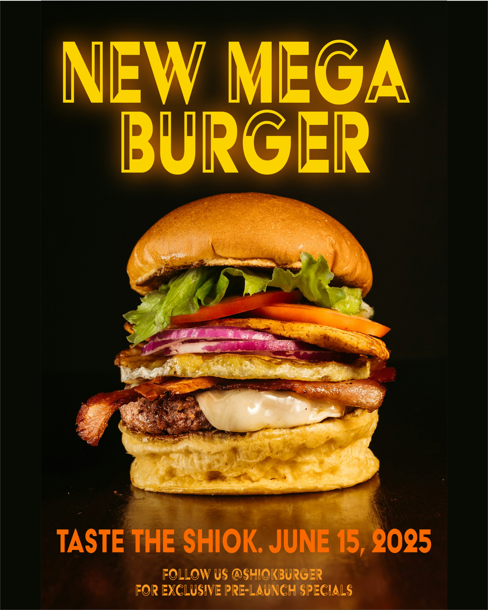
A cohesive branding project showcasing the visual identity, concept development, and campaign assets for 67 Energy, a youth-driven performance drink centred on focus, speed, and controlled intensity.

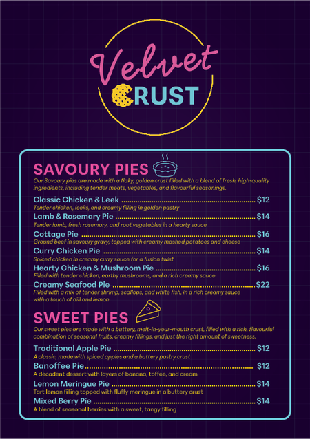
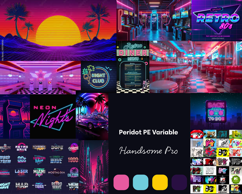
A neon-era inspired visual identity for a retro-themed F&B brand.
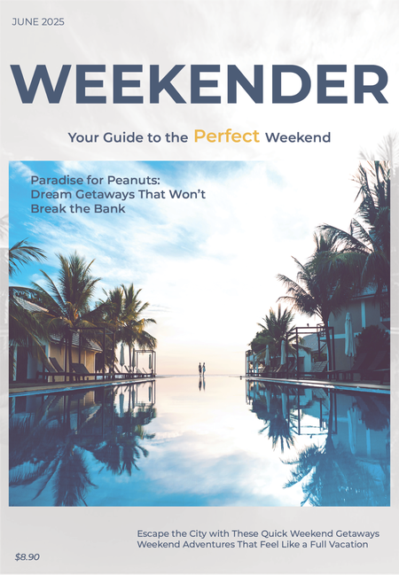
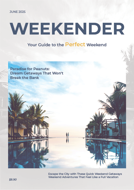
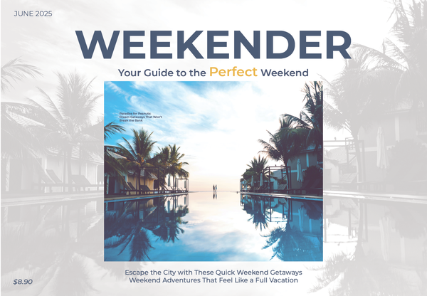
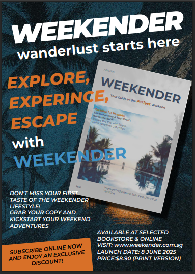
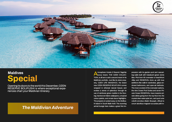
A complete editorial design project featuring multiple cover formats and a promotional advertisement encouraging readers to purchase the magazine.
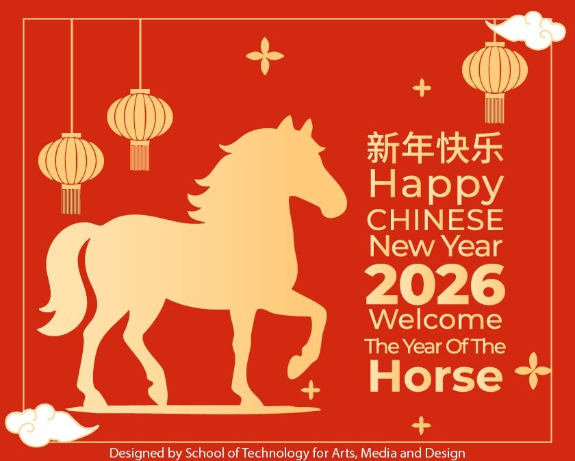
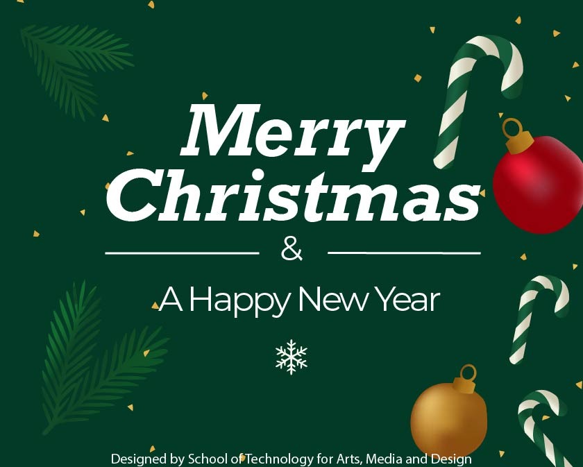
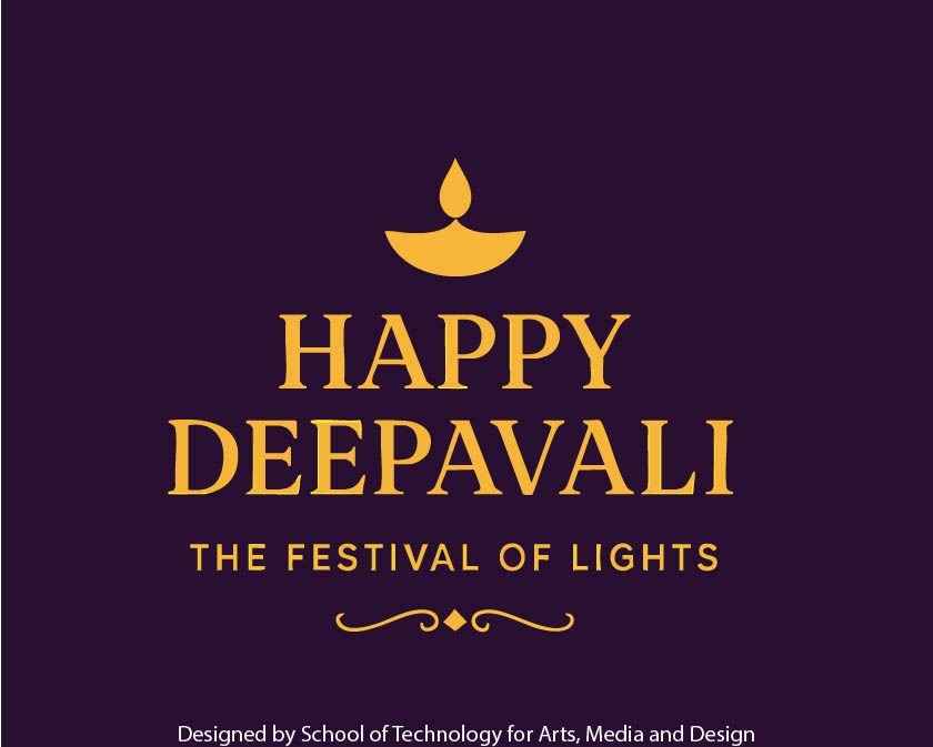
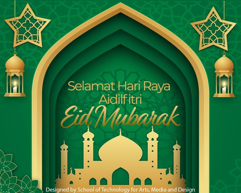
A cohesive set of celebratory e-cards designed for RP staff, applying colour theory, typography pairing, and layout principles across five major occasions. Each visual expresses a distinct cultural mood while maintaining professional clarity and warmth.
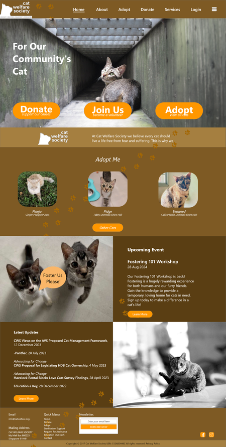
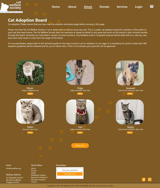
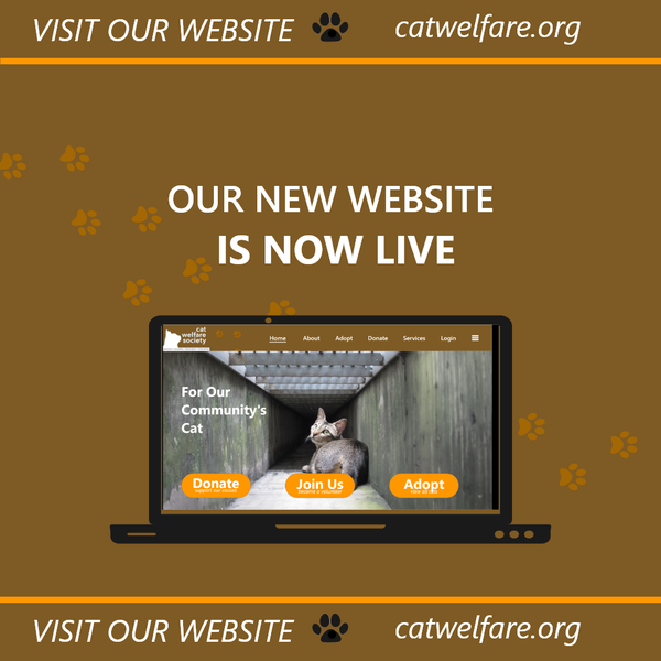
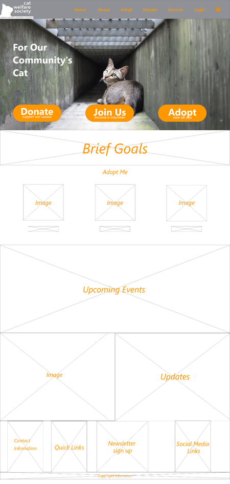
A cohesive collection showcasing the refreshed website interface, user-centred layouts, social media announcement content and supporting prototypes created for the Cat Welfare Society (CWS), a non-profit advocating for the humane management and welfare of community cats in Singapore.
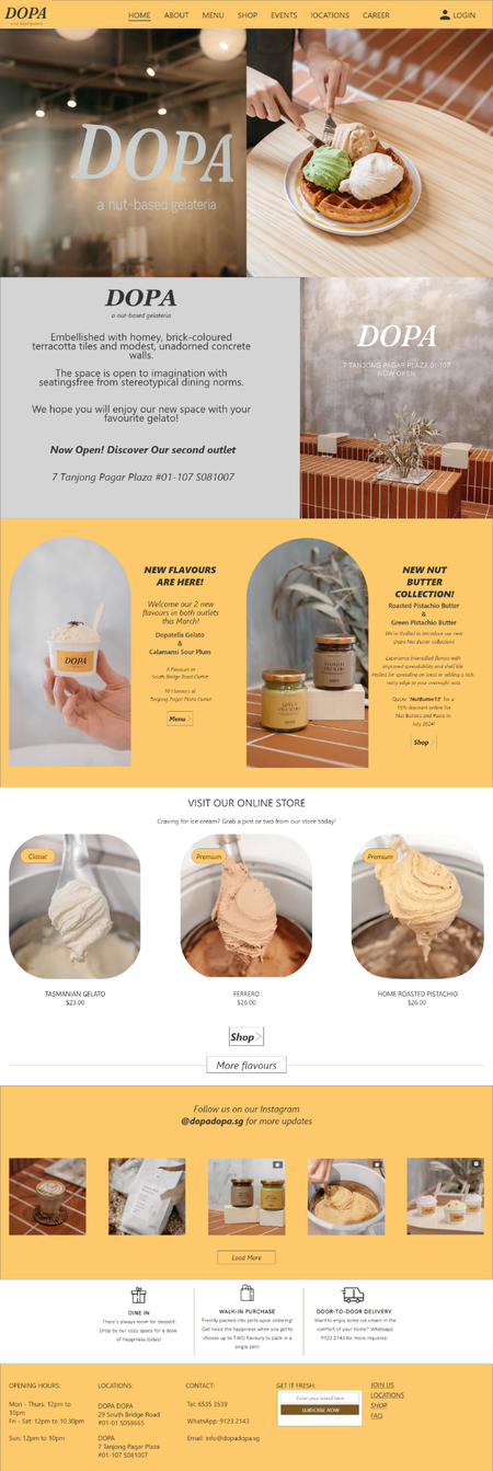
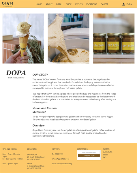
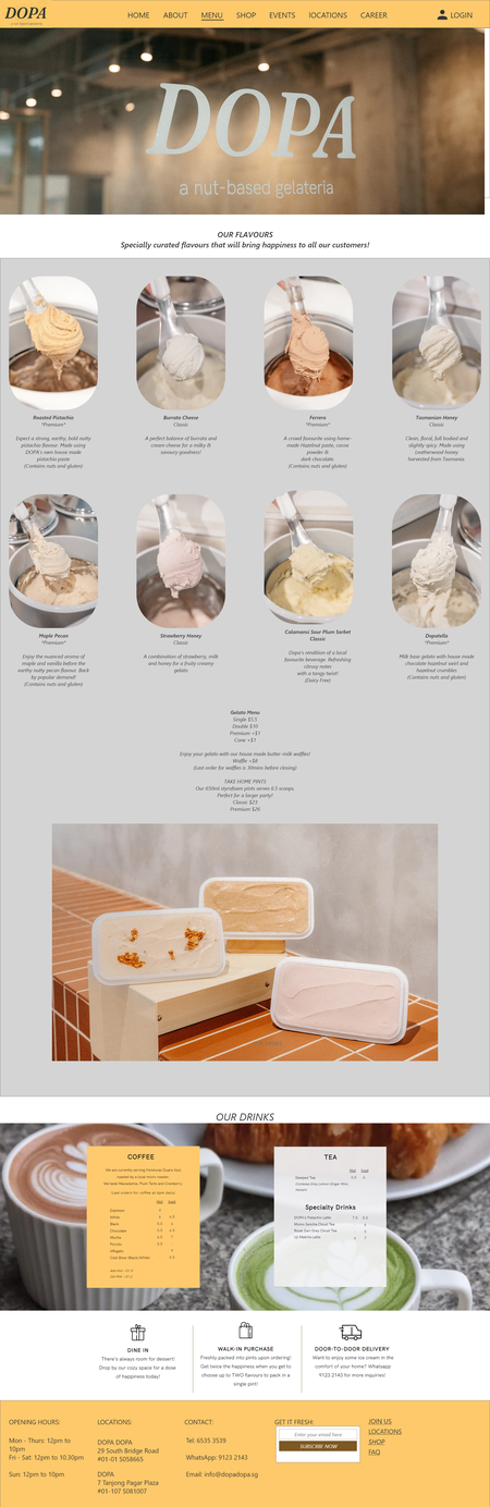
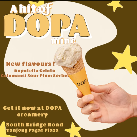
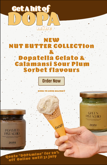
A unified collection showcasing the brand identity, website redesign, social media presence and promotional content created for DOPA, a nut-based gelateria.
My background is shaped by curiosity, discipline, and a drive to keep improving. I’ve always enjoyed exploring new experiences, learning new skills, and challenging myself creatively and personally. These values guide the way I approach my work today.